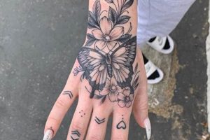
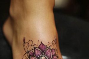
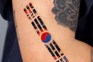
Typography in body art represents a critical design choice. Selecting an appropriate typeface influences the aesthetic impact, readability, and overall message conveyed. For instance, a script typeface evokes elegance and fluidity, while a bold, blocky font projects strength and simplicity. The range of styles available, from traditional to modern, provides extensive creative opportunities.
Meaningful and expressive body art relies heavily on thoughtful typeface selection. A well-chosen design enhances the visual appeal and longevity of a tattoo. Historically, specific fonts have been associated with particular cultures or subcultures, adding layers of symbolism and personal significance. This careful consideration contributes to the creation of a powerful and enduring piece of personal expression.
This article will delve into various stylistic categories, exploring the nuances of popular choices like script, gothic, traditional, and minimalist fonts. Practical advice on selection criteria, including size, placement, and skin tone considerations, will also be provided. Furthermore, the article will examine the evolving trends in tattoo lettering and offer guidance on collaborating effectively with tattoo artists to achieve the desired outcome.
1. Style
Style in tattoo lettering significantly influences the overall aesthetic and conveys specific emotions or messages. A thoughtful choice harmonizes the design with individual preferences and the tattoo’s subject matter. This section explores crucial stylistic facets to consider.
- Script
Script typefaces emulate handwriting, ranging from elegant calligraphy to casual, flowing letters. Popular choices include traditional scripts reminiscent of vintage signage and modern calligraphy with expressive flourishes. Script styles are well-suited for names, quotes, or phrases where a sense of fluidity and grace is desired. However, legibility can become an issue with highly elaborate scripts or smaller sizes.
- Gothic
Gothic fonts, characterized by their dramatic, angular serifs and bold strokes, project a sense of power, mystery, or traditionalism. Variations within this category range from intricate blackletter styles to simpler, more readable gothic typefaces. These fonts are often chosen for tattoos that incorporate medieval imagery, religious iconography, or band logos. Legibility requires careful consideration, particularly with highly ornate gothic styles.
- Traditional
Traditional tattoo fonts draw inspiration from classic tattoo designs, often featuring bold lines, decorative elements, and a vintage aesthetic. These fonts frequently appear in American traditional, Japanese, or tribal tattoo styles. Examples include bold outlines, shadowed lettering, and decorative flourishes. Traditional fonts effectively evoke a sense of history and authenticity.
- Minimalist
Minimalist typefaces prioritize simplicity and clean lines. These designs typically employ sans-serif fonts with geometric shapes and uniform stroke weights. Minimalist styles offer a modern, understated aesthetic. They are suitable for short phrases, single words, or geometric designs, emphasizing clarity and legibility.
Ultimately, style selection depends on personal preference, desired aesthetic, and the overall message conveyed by the tattoo. Careful consideration of these facets ensures a harmonious and impactful design that resonates with individual expression.
2. Readability
Readability in tattoo design is paramount for ensuring the clarity and longevity of the intended message. A legible tattoo remains aesthetically pleasing and comprehensible over time, even as the ink ages and the skin changes. This section examines key factors influencing readability in tattoo lettering.
- Font Choice
Intricate or highly stylized fonts, while visually appealing, can compromise readability, especially at smaller sizes. Overly decorative scripts or densely packed gothic styles may blur together over time, obscuring the intended message. Simpler, cleaner fonts with distinct letterforms generally offer better long-term legibility. Selecting a typeface that balances aesthetics with clarity is essential.
- Size and Spacing
Sufficient size and appropriate spacing between letters and words are crucial for maintaining legibility. Small, tightly spaced letters tend to blur together as the tattoo ages, rendering the design difficult to decipher. Larger letterforms and ample spacing improve clarity and ensure the tattoo remains readable over time. The chosen placement on the body also influences size considerations.
- Line Weight and Contrast
Strong contrast between the ink and skin tone is essential for readability. Thin, delicate lines may fade or become less distinct over time, especially on lighter skin tones. Bold, thicker lines provide better contrast and ensure the tattoo remains visible and readable as it ages. The artist’s skill in achieving consistent line weight contributes significantly to the overall clarity.
- Placement on the Body
The area of the body chosen for the tattoo influences readability. Areas with greater curvature or frequent movement, such as fingers or inner lips, may distort the appearance of the lettering and impact legibility. Flatter areas like the back, chest, or forearm offer a more stable canvas for maintaining clear and readable lettering over time.
Prioritizing readability ensures the tattoo remains a clear and aesthetically pleasing piece of art for years to come. By considering font choice, size and spacing, line weight and contrast, and placement on the body, individuals can collaborate with their tattoo artists to create a design that is both visually appealing and enduringly legible.
3. Size and Placement
Size and placement are integral to the effectiveness of tattoo lettering. The chosen dimensions and location on the body significantly impact legibility, aesthetics, and the overall composition of the design. A small, intricate script may be suitable for the wrist or ankle, while a larger, bolder font works well on the back or chest. For example, a detailed portrait tattoo might incorporate a small name or date in a script font beneath it, while a large tribal design might use a bold, geometric font for a central inscription. The interplay between size, placement, and chosen typeface creates visual harmony and ensures the intended message is clearly conveyed.
The size of the tattoo directly affects the level of detail achievable. Intricate designs require sufficient space to render fine lines and details effectively. A small tattoo may limit the complexity of the chosen font, while a larger tattoo offers more freedom for elaborate scripts or decorative elements. Placement further influences the perceived size and impact of the tattoo. A design on a curved surface, like the bicep or forearm, appears differently than the same design on a flatter surface like the back. Understanding these spatial relationships allows for informed decisions that enhance the visual impact and longevity of the tattoo. For instance, a name tattooed on the inner finger might be small and simple, utilizing a clean, sans-serif font for maximum readability, while a quote along the ribcage might allow for a larger, more flowing script font.
Effective tattoo design requires careful consideration of the relationship between typeface, size, and placement. These elements work in concert to create a balanced and aesthetically pleasing composition. Appropriate scaling ensures legibility and prevents the tattoo from appearing overwhelming or underwhelming in relation to the body. Thoughtful placement complements the body’s natural contours and highlights the chosen design elements. Considering these factors ensures the final result is a well-integrated and impactful piece of body art.
4. Meaning and Symbolism
Meaning and symbolism are deeply intertwined with typeface selection in tattoo art. Fonts possess cultural and historical connotations that contribute significantly to the overall message conveyed. A chosen typeface can evoke specific eras, subcultures, or artistic movements. For example, blackletter fonts often associated with gothic or medieval themes can communicate a sense of history, tradition, or spirituality. Similarly, script typefaces, reminiscent of calligraphy or handwriting, can express elegance, romance, or personal connection. The selection of a typeface, therefore, transcends mere aesthetics and becomes a vehicle for expressing personal values, beliefs, or affiliations. Choosing a font that resonates with the intended symbolism enhances the tattoo’s depth and personal significance.
Specific fonts carry inherent symbolic weight, influencing the interpretation of a tattoo. Consider the difference between a name tattooed in a delicate script versus a bold, geometric sans-serif font. The former might suggest elegance and femininity, while the latter could project strength and modernity. These subtle yet powerful distinctions underscore the importance of considering the symbolic implications of different typefaces. Furthermore, the integration of cultural or historical references through font choices can enrich a tattoo’s narrative. Using a typeface traditionally associated with a specific culture or historical period can add layers of meaning and create a visual link to personal heritage or interests. For instance, a tattoo featuring a phrase in a traditional Japanese font can convey respect for Japanese culture and aesthetics.
Understanding the symbolic language of typefaces empowers individuals to create tattoos that resonate deeply with personal meaning. It allows for a more nuanced and intentional approach to design, ensuring the chosen typeface aligns with the desired message and personal narrative. Careful consideration of these symbolic connections elevates a tattoo from a purely aesthetic decoration to a powerful statement of self-expression. By recognizing the interplay between font choice, meaning, and symbolism, individuals can collaborate with tattoo artists to create body art that reflects their values, beliefs, and individual stories.
5. Artist Collaboration
Effective collaboration with a skilled tattoo artist is paramount when realizing desired typeface choices. Open communication ensures the chosen font aligns with the overall design, complements the individual’s anatomy, and remains legible over time. A skilled artist provides valuable insights into technical considerations, such as ink flow, skin type, and the potential for ink spread, which can significantly affect the long-term appearance of the tattoo. For instance, an artist might advise against using an extremely thin, delicate script on an area prone to stretching or wrinkling, as this could compromise legibility over time. They can also guide clients toward fonts that translate well to the chosen size and placement, ensuring the design remains impactful and aesthetically pleasing. This collaborative approach allows for adjustments and refinements based on the artist’s expertise, resulting in a final product that meets the client’s vision while adhering to best practices for tattoo application.
The artist’s expertise extends beyond technical execution to encompass design principles and aesthetic considerations. They can offer alternative font suggestions that align more closely with the desired message or aesthetic, suggest modifications to existing choices to enhance readability or visual impact, and ensure the chosen typeface complements the overall composition of the tattoo. This collaborative process is crucial for achieving a harmonious and well-executed design. For example, an artist specializing in traditional Japanese tattooing might suggest a specific font that holds cultural significance and complements the imagery of a koi fish or dragon. Similarly, an artist skilled in lettering might recommend adjustments to kerning or letter spacing to optimize readability and visual balance within the design.
Successful tattoo lettering relies heavily on the synergy between client vision and artistic expertise. Clear communication, active listening, and a willingness to consider professional guidance ensure the final result is a technically sound and aesthetically pleasing tattoo that reflects the individual’s desired message and personal style. This collaborative approach maximizes the potential for a successful and enduring piece of body art that meets both the client’s expectations and the artist’s standards of quality and craftsmanship. Ultimately, a strong artist-client relationship fosters a creative environment where individual expression and technical expertise combine to create meaningful and lasting body art.
6. Trends and Longevity
Tattoo trends, while offering contemporary appeal, must be considered alongside the enduring nature of tattoos. Balancing current styles with timeless design principles ensures the tattoo remains aesthetically pleasing over decades. This necessitates careful evaluation of trending typefaces and their potential for long-term visual appeal.
- Typeface Selection and Trends
While exploring current font trends can be inspiring, prioritizing timeless legibility and classic aesthetics is crucial. Highly stylized or overly intricate fonts popular in the moment may fall out of favor or become visually dated over time. Classic serif and sans-serif fonts, as well as traditional tattoo scripts, often maintain their appeal due to their established history and balanced design. Consider how certain fonts associated with specific decades can quickly date a tattoo, whereas simpler, well-established typefaces tend to age more gracefully.
- Impact of Aging and Skin Changes
Skin naturally changes over time, affecting the appearance of a tattoo. Fine lines and intricate details can blur or lose clarity as the skin ages and loses elasticity. Selecting a typeface with sufficient line weight and clear letterforms helps maintain legibility and visual appeal over the long term. Bold, simple fonts tend to hold up better than delicate, thin scripts. Placement on the body also plays a role, as areas prone to stretching or wrinkling may require simpler designs for lasting clarity.
- Cultural and Personal Significance
While trends come and go, the meaning behind a tattoo should remain timeless. Choosing a typeface that aligns with personal values, cultural heritage, or timeless symbolism ensures the tattoo remains personally relevant and meaningful regardless of changing trends. A tattoo commemorating a loved one, for example, would benefit from a classic and enduring typeface rather than a trendy font that might lose its appeal over time. This approach prioritizes the tattoo’s enduring message over fleeting stylistic trends.
- Adaptability and Future Modifications
Considering the potential for future additions or modifications to a tattoo is crucial. Selecting a typeface that can be easily incorporated into future designs ensures cohesive aesthetics over time. Simple, classic fonts often provide greater flexibility for future additions than highly stylized or trend-specific typefaces. This forward-thinking approach allows for seamless integration of new elements without clashing styles or compromising the overall composition.
Ultimately, achieving longevity in tattoo design involves a thoughtful balance between current aesthetics and timeless principles. Prioritizing readability, selecting fonts with enduring appeal, and considering the long-term effects of aging and skin changes ensures the tattoo remains a source of personal expression and aesthetic satisfaction for years to come.
Tips for Choosing Tattoo Lettering
Selecting appropriate lettering for a tattoo requires careful consideration of several factors. These tips provide guidance for making informed decisions that ensure a visually appealing and enduring design.
Tip 1: Research Extensively
Thorough research is crucial before committing to a typeface. Explore various font categories, considering their historical context, cultural associations, and visual impact. Examine numerous examples of tattoos featuring different fonts to understand how they appear on the skin.
Tip 2: Prioritize Readability
Legibility is paramount, especially for smaller tattoos or those incorporating intricate details. Opt for fonts with clear letterforms and sufficient spacing between characters to ensure the design remains readable as the tattoo ages.
Tip 3: Consider Size and Placement
The size and location of the tattoo influence font selection. Smaller tattoos necessitate simpler, bolder fonts, while larger designs allow for greater intricacy. Placement on the body affects how the font appears and should be carefully considered in conjunction with the chosen typeface.
Tip 4: Reflect Personal Meaning
Select a font that resonates with the intended message and personal symbolism. The typeface should complement the overall design and reflect individual style and values.
Tip 5: Consult with a Tattoo Artist
Professional guidance from a skilled tattoo artist is invaluable. Discuss font choices, placement, and size with the artist to ensure the design translates effectively onto the skin and remains aesthetically pleasing over time. Their expertise ensures technical feasibility and optimal visual impact.
Tip 6: Test the Design
Before committing to a permanent tattoo, create temporary versions of the design using stencils or temporary tattoo paper. This allows for visualization of the chosen font on the skin and provides an opportunity to assess size, placement, and overall aesthetic before the final application.
Tip 7: Consider Longevity
Tattoos are permanent, therefore, consider the long-term implications of font choice. Highly stylized or trendy fonts may lose their appeal over time. Opting for classic, timeless typefaces ensures the design remains visually appealing and personally relevant for years to come.
By adhering to these guidelines, individuals can make informed decisions about tattoo lettering, ensuring a design that is both aesthetically pleasing and personally meaningful for years to come.
This careful consideration of typeface selection contributes significantly to the creation of a successful and enduring tattoo. The subsequent conclusion will summarize key takeaways and reiterate the importance of thoughtful lettering choices in body art.
Frequently Asked Questions
This section addresses common inquiries regarding typeface selection for tattoos.
Question 1: How does one determine the most suitable typeface for a tattoo?
Typeface suitability depends on several factors, including the desired aesthetic, the tattoo’s message, placement on the body, and individual preferences. Researching various font categories and consulting with a tattoo artist are crucial steps in this process. The artist can offer expert guidance on fonts that translate well to skin and age gracefully.
Question 2: Can any font be used for a tattoo?
While technically many fonts can be used, not all fonts are suitable for tattooing. Highly intricate or overly thin fonts may lose clarity over time due to ink spread and skin changes. A skilled tattoo artist can advise on font choices that ensure long-term legibility and visual appeal.
Question 3: What is the impact of tattoo size on font choice?
Size significantly influences font selection. Small tattoos require simpler, bolder fonts for readability, while larger tattoos offer more flexibility for intricate designs. Placement on the body also impacts font suitability, as areas with more curvature or movement may require simpler fonts for clarity.
Question 4: How does one ensure a chosen typeface remains legible over time?
Legibility depends on factors like font choice, size, placement, and the artist’s skill. Choosing a font with sufficient line weight, clear letterforms, and appropriate spacing helps maintain readability as the tattoo ages. Consulting with an experienced artist is crucial for ensuring the chosen typeface translates well to the skin and withstands the test of time.
Question 5: What are the potential drawbacks of choosing a trendy typeface?
Trendy typefaces risk becoming dated and losing their appeal as styles evolve. Prioritizing timeless designs and classic fonts often results in a more enduring and aesthetically pleasing tattoo that stands the test of time.
Question 6: How important is the consultation with a tattoo artist for font selection?
Consultation with a skilled tattoo artist is essential for successful typeface selection. Artists provide expert advice on font suitability, technical considerations, and design principles, ensuring the chosen typeface aligns with the individual’s vision and translates effectively onto the skin. Their experience and technical knowledge are invaluable for creating a visually appealing and enduring tattoo.
Careful consideration of these frequently asked questions empowers individuals to make informed choices regarding tattoo lettering, ensuring a design that aligns with their personal style, desired message, and long-term aesthetic preferences.
The subsequent conclusion will summarize key takeaways and offer final recommendations for achieving a successful and meaningful tattoo design.
Conclusion
Careful typeface selection is essential for creating impactful and enduring body art. This exploration has highlighted the multifaceted nature of choosing appropriate lettering, emphasizing the interplay between aesthetics, readability, symbolism, and technical considerations. Key factors such as font style, size, placement, and artist collaboration contribute significantly to the overall success and longevity of a tattoo design. Understanding the historical and cultural connotations associated with various typefaces empowers informed decision-making, ensuring the chosen lettering aligns with personal values and intended messages. Prioritizing readability and timeless design principles ensures the tattoo remains visually appealing and personally relevant for years to come.
Ultimately, a thoughtfully chosen typeface elevates a tattoo from a simple decoration to a powerful expression of personal identity. The permanence of tattoos necessitates careful consideration of these factors, transforming the selection process into an act of deliberate and meaningful self-expression. This mindful approach ensures the chosen design resonates with personal significance and stands the test of time, becoming an enduring reflection of individual narratives and artistic vision.


